Education design
Improvements in interaction, user flow & usability for a suite of nationwide education assessment products
Roles: user research, design strategy, interaction design, prototyping, interface design, wireframing (visual design largely dictated by Marketing, despite my objections)
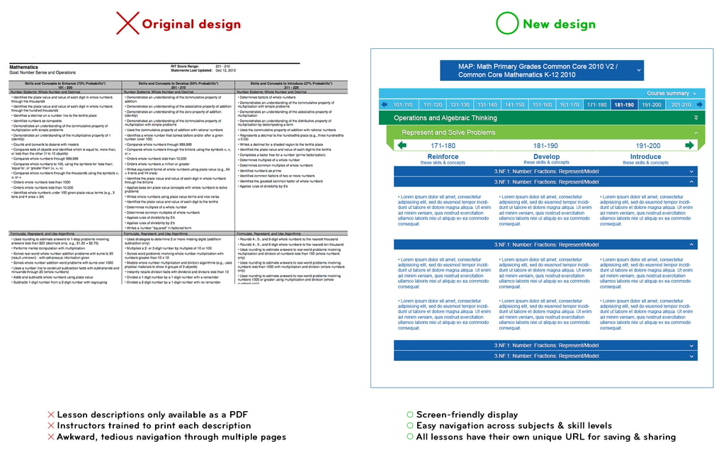
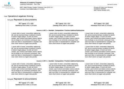
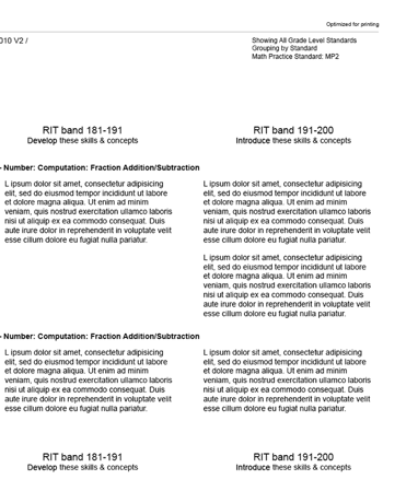
Unresponsive, antiquated methods made planning difficult for instructors
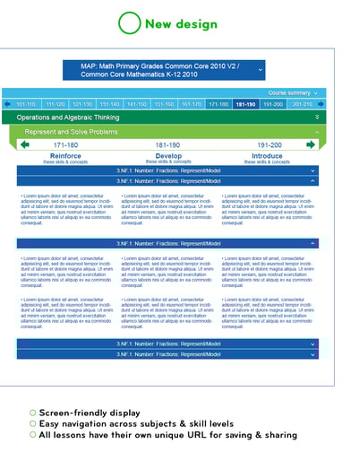
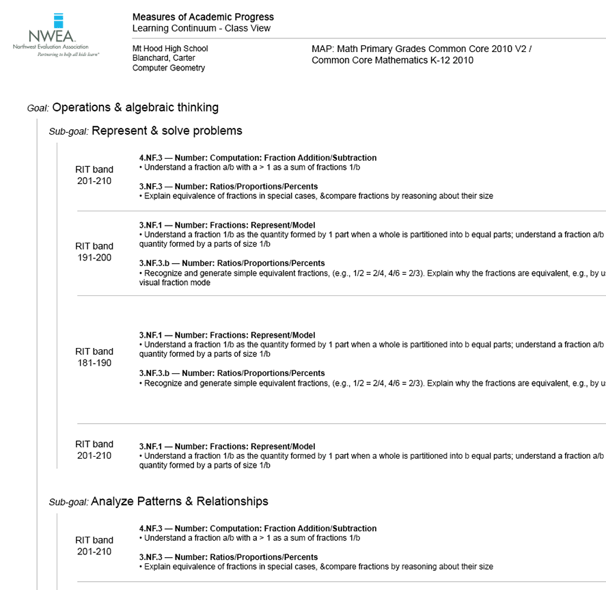
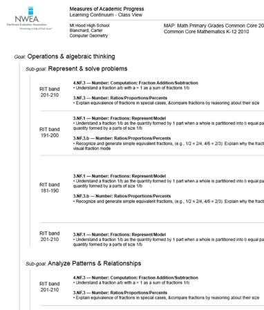
After a few iterations, I came up with a design that let instructors, parents and students track their progress and find lesson descriptions online. Not only did this make navigation and sharing faster, but loading all the lessons at once meant no more waiting when changing between classes or modifying filters.
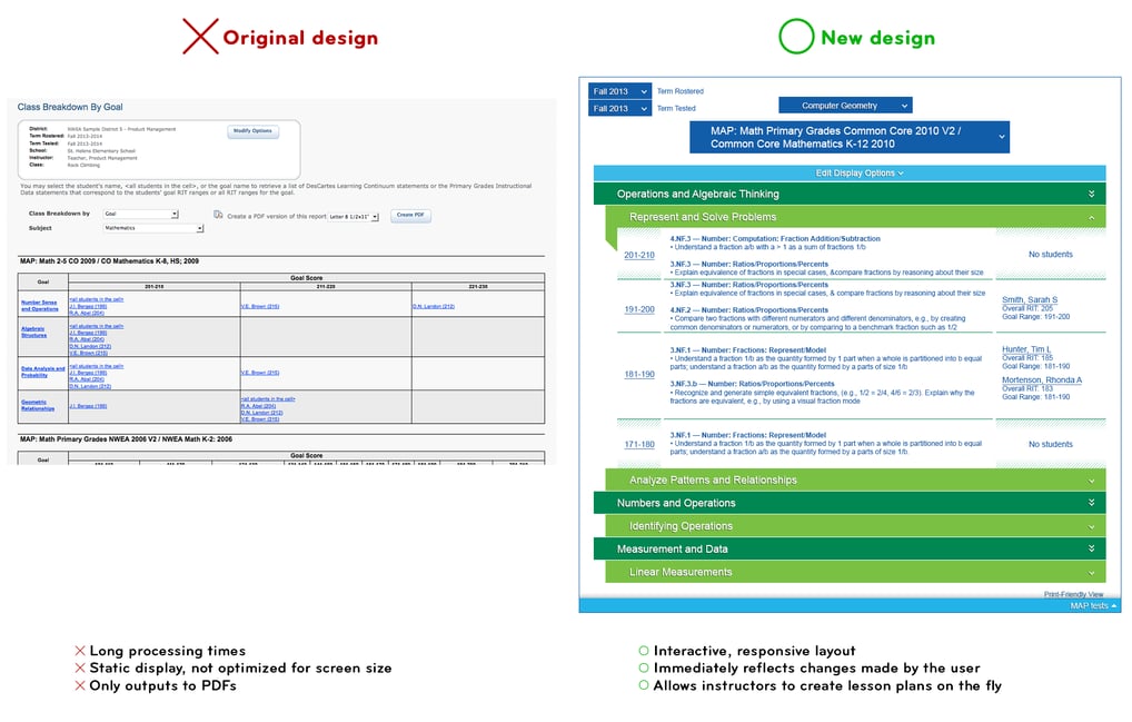
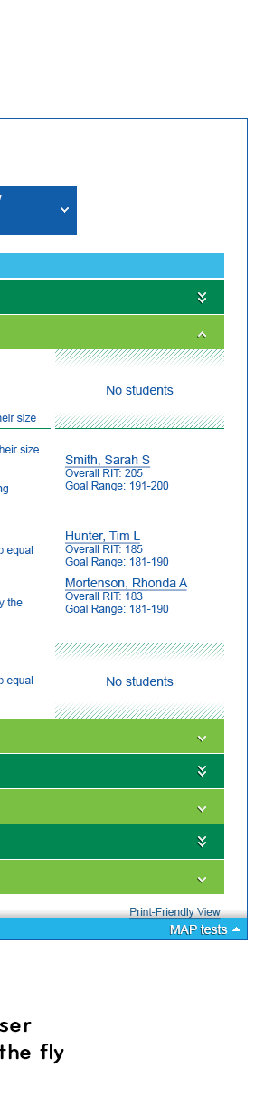
Similarly, a classroom-specific feature provided instructors with every student's current standing and appropriate lesson ranges for each one—but this was also done in a static layout that didn't meet the users' needs (and violated all sorts of privacy standards). The new design offers better navigation and contextual options for crafting lesson plans within the same product.
The problem
A dynamic solution
Unresponsive, antiquated methods made planning difficult for instructors
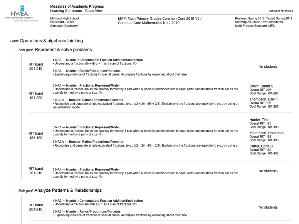
When I joined the company, their instructional planning service was essentially a giant PDF full of tables that had to be printed out and—we learned through user testing—cut into strips and often taped on the walls so instructors could plan their lessons.
Of course there's nothing wrong with paper, if that's your jam, but there's no reason to force teachers to print and cut out their lessons every week, if we could come up with a more efficient method directly in the browser.
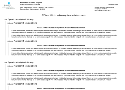
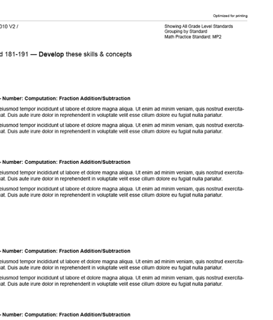
Of course, there will always be a reason to print these lesson plans, so I did design a printer-friendly version as well. This version only prints relevant lessons, however. No use printing 20 pages of lessons when you're only going to use 6.
Unresponsive, antiquated methods made planning difficult for instructors
The company's student norms calculator used to be an XLS file that instructors had to download, open in Office (meaning Chromebooks and mobile devices were out of luck), and follow a whole page of instructions just to get the file to output a single number needed to help find each student's status.
The new design runs in any browser, and only asks for a couple simple inputs for the same result. This also allows for faster calculation and better privacy, as an instructor or parent can add and remove individual calculators to only show what's relevant to an individual student.