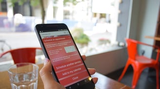
My client, a small nail art studio, was having a pretty bad time finding a scheduling service that worked for their needs, didn’t confuse their clients, and didn’t cost a fortune every month to maintain.
We tried a handful of services, but none of them was quite what we were looking for. Knowing that what we needed was relatively simple, we decided to design our ideal service, and have that built for us instead.
SalonBot
Roles: product strategy, user research, information architecture, interaction design, prototyping, mobile design, interface design, branding & identity
The problem
So many services, so little humanity
Research time
Developers of the services we used were focused on adding new functionality, and seemed much less interested in usability and user comfort. They were stacking features on top of features, making for more confusion and less clarity.
We decided we wanted a service that worked a little like a chatbot: a persistent tool always present on the site that would ask a series of simple questions, then schedule your appointment for you, and you’d be on your way.
A more human approach
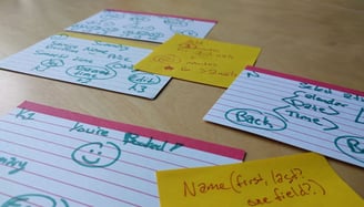
Already familiar with the salon’s services, I listened to conversations with clients as appointments were booked, as well as consultations during appointments, to better understand how to zero in on which services a client would likely want based on the answers they provide.
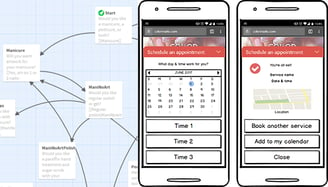
This research led to a simple flowchart of questions and answers, each path leading to a different service provided by the salon. These were the questions and options we would build into our bot to provide a more usable, more comfortable scheduling service.
I used Twine, a tool typically used for text games, to map out these questions before creating the wireframes in Balsamiq.
Usability testing
The key is always cupcakes
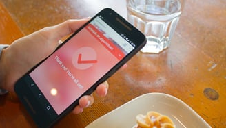
After drafting the first run of wireframes, we tested the application on real people, both existing and potential clients. Those familiar with the old scheduling service were all visibly delighted by the new approach, and we were able to validate a lot of ideas, as well as trim a few things that weren’t as necessary.
Screen mockups
Might as well make it pretty
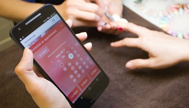
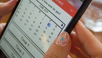
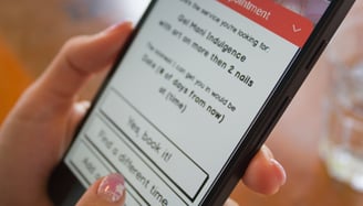
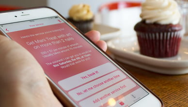
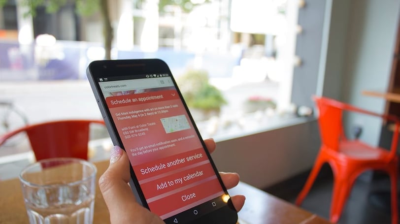
Finally, we were confident enough to create the visual mockups, for both desktop and mobile web.
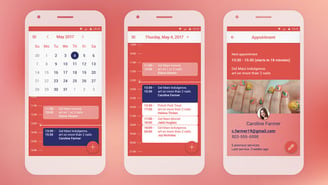
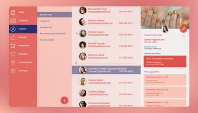
I also tested and designed a calendar interface for the artist, which will plug into Google Calendar for now, and a contact list to easily find past and future clients. Both services ignore events and contacts not related to the business.
Wrapping it all up
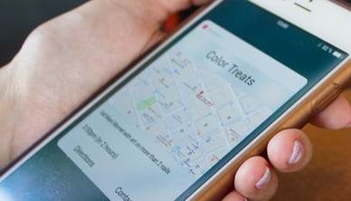
I figured a future service might let users select from a variety of salons, so I came up with some early versions of an app that would provide a list of salons in the area, followed by the same scheduling service.
But for now, we’re keeping it simple and just building a no-frills scheduler. No payment processing, no team management. Just a scheduler, calendar, and contact list.
Which is exactly what the client needs right now.

