Nike projects
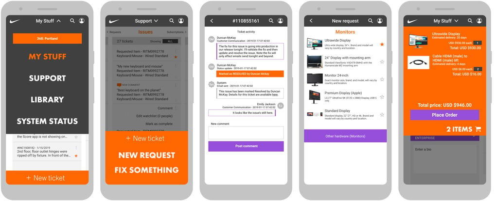
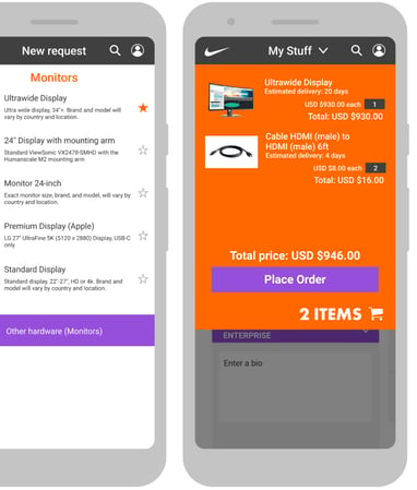
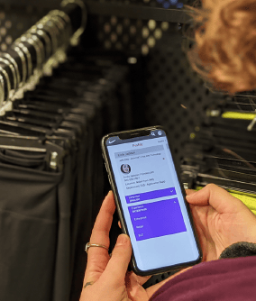
NikeNow Mobile is a native app allowing access to all NikeNow features, replacing The Ticket, Nike’s previous retail service app.
This app includes the request catalog, incident forms, Knowledge Base articles, and access to users’ tickets, with gesture-friendly interactions and a very Nike appearance.
Along with something that helps users quickly get what they need, we wanted something we could be proud of when customers catch a glimpse of the app being used in our stores.
NikeNow Mobile
NikeNow Elevate
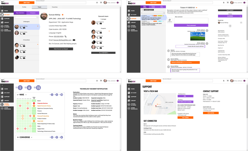
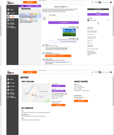
Elevate was our year-long initiative to evolve NikeNow into a more personalized, more usable and more comfortable experience.
This project included designs for a handful of features being rolled out over time: a dashboard-style navigation menu, clearer communication, more accessible features, and more on-brand visuals and interactions.
In a future release, new categories will be accessible to users depending on role, language, location, and other details currently not being taken advantage of, all helping to make NikeNow serve as a more robust, full-service destination for employees with any number of technical concerns.

Persona development
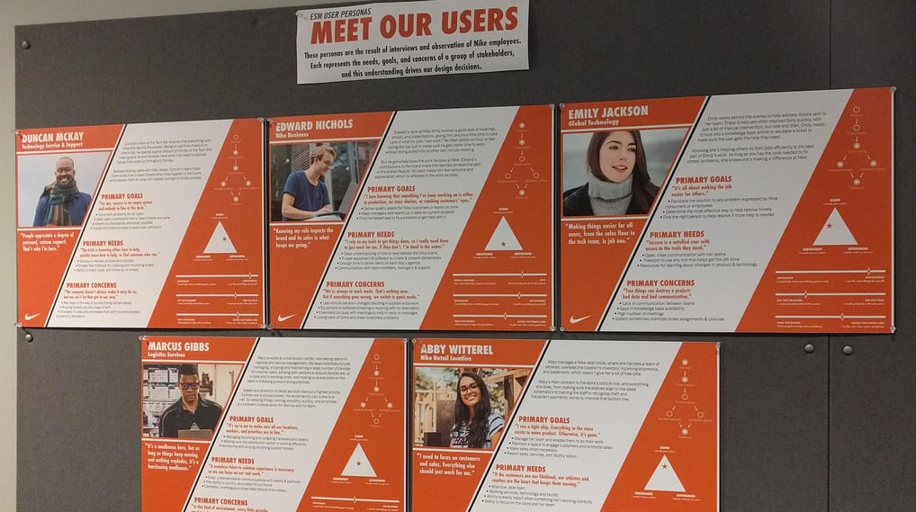
With every project, I make sure we understand our users’ goals, needs and concerns by researching how they approach their responsibilities and observing how they go about their work.
These five personas come from months of research of 40 users, including about a dozen in-person observation sessions.
Hanging these personas in the hallway where others could see them helps employees start conversations about the very people we‘re working to support.
Performance Bar queueing

Nike’s Performance Bars are a godsend, but standing in line when you need help isn’t terribly efficient. We’d been talking about letting users take a number and go about their day, so they can use that time more effectively.
Our new Performance Bar displays and queuing service allow for just that. Users can see how many people are currently waiting for help, along with their estimated wait time, take a number, and receive a notification when it’s time to head to the Performance Bar.
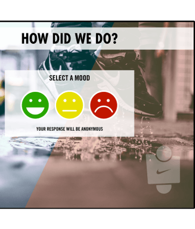
After their visit, a final display gives them the opportunity to anonymously rate their service.
Asset inventory automation
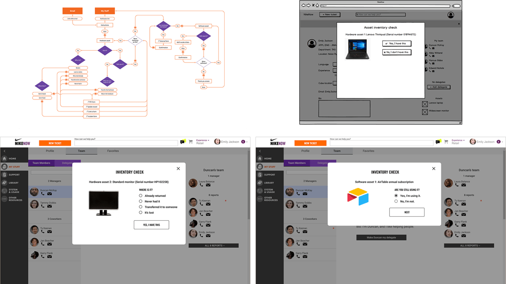
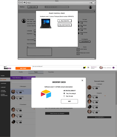
Until recently, Nike had a manual approach to managing hardware and software assets. Emails were sent to employees asking them to personally check their asset list in NikeNow against the assets they actually have.
It was a good first step, but I felt we could do a lot of that work automatically, rather than relying on the users to do it for us.
This initiative not only automates the audit process, but will notify users when it’s time to run the check, keep track of who’s gone through the steps, and help the company know what hardware needs to be picked up from which buildings.
Web form redesign
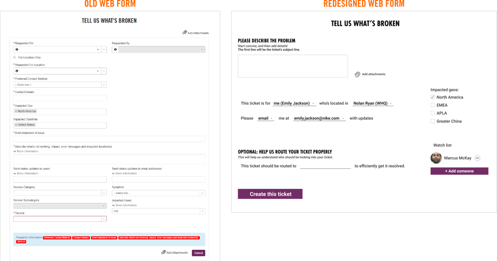
Our users’ main frustration points regarding NikeNow’s incident forms were that they were a bit daunting with all those fields, and the Service section, while optional for most users, is difficult to navigate, often leading to improperly routed, lost and unfulfilled tickets.
The new version of this form consolidates several fields, fills out default values for many sections, and provides a natural-language flow to help users understand the point behind each value being asked of them.
Notification email redesign
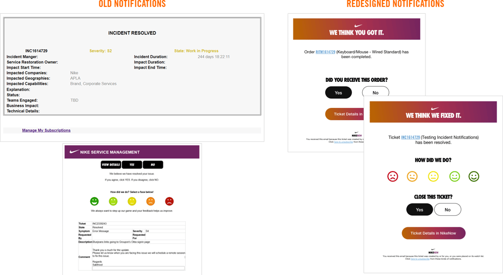
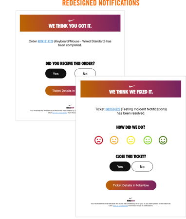
NikeNow and ServiceNow send a number of email notifications to users, and a lot of them get deleted without even being read. A lot of them are a bit difficult to read, both with the way the information is presented and font size.
Working with a visual designer, I helped come up with a layout and set of actions that make these emails easier to understand at a glance and take action when necessary.
Team logos & workplace posters
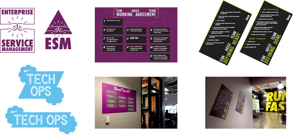
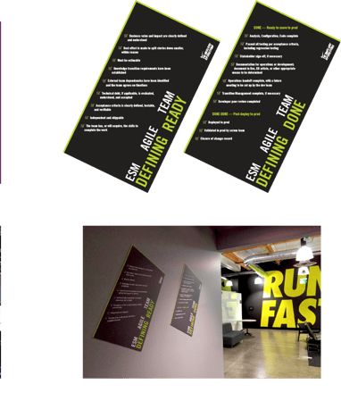
Please don't share this page with anyone outside the organization I've sent it to directly.
I've been given permission to share it only with non-competitive potential employers.
