My UX process
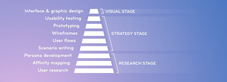
A well-designed experience follows a series of steps, each providing a foundation for the one that comes after it. The more time and resources go into each stage, the more confident we can be with future steps. Any cut corners, especially early in the project, will lead to decisions based on assumptions, rather than understanding.
There are plenty of user research methods out there, and I tend to start with in-person observation and interviews, so we can determine what we should be looking for when we start with the quantitative studies later on.
Of course, covid's made all this a bit trickier, but there are plenty of ways to do remote research and observation.
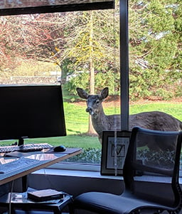
(These sessions are confidential, so I can't show an actual user at their desk. Instead, here's a deer that visited right after a research session.)
User research
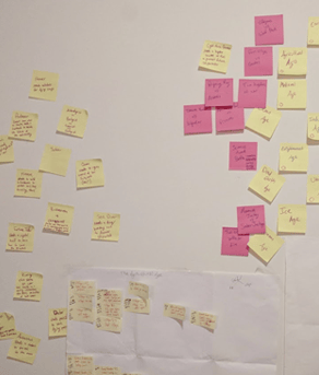
Affinity mapping
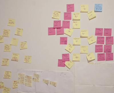
Once we've observed a few hours of actions and intentions, we start bundling similar actions into categories, until we've found common needs that similar users share.
This can be a huge project with thousands of cards, or a simple distillation of needs based on common observations and quotes shared by the people we spoke with.
Persona development
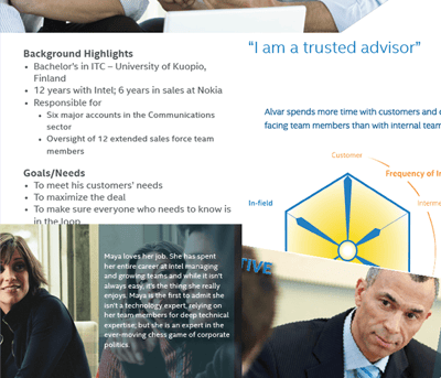
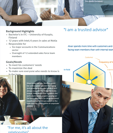
Then it's on to the personas. We only create these if we're confident we've done enough research to really understand our users' needs, goals and concerns.
While I place personas in the Research stage of the process, when there's a dedicated research team I'm not a part of, I usually work with the team to develop personas. That makes the handoff from research to strategy much smoother.
Scenario writing
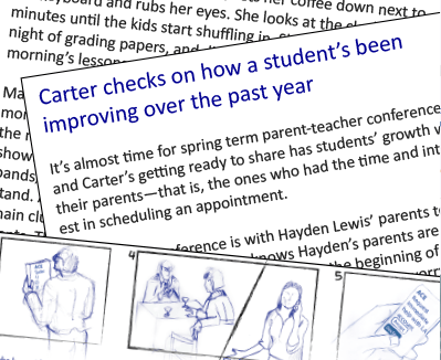
Once we understand who we're designing for and what they need, we write scenarios, each specifically crafted for one persona to reach one goal. These scenarios aren't concerned with how things happen; we'll get to that later.
User flows
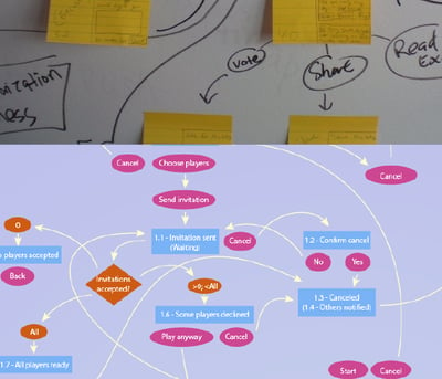
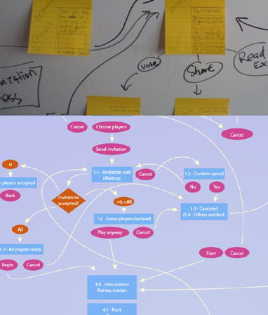
Now that the team's in agreement on the experience we want to deliver to our users, using the scenarios as our guide, we create user flows that easily translate into site maps. This is usually no more complex than reading through each scenario and pointing out which steps will require a new screen, then creating nodes for each screen and making a first pass at how they'll all be connected.
Wireframes
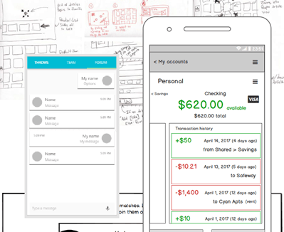
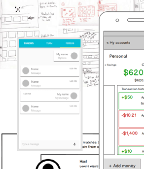
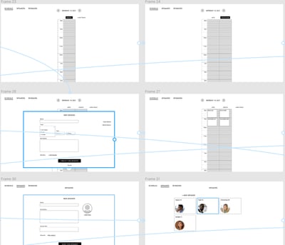
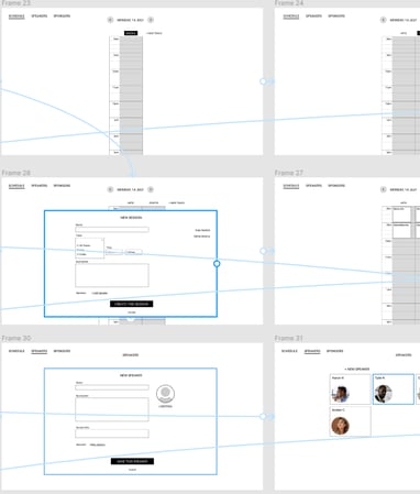
And then each screen or page of the site map gets made into a wireframe. With this step, we aren't concerned with colors, font sizes or imagery, but we need to make sure that interactions are roughly where users expect them to be, tasks can be accomplished without any confusion, and every step of a task is accounted for.
Interactive prototyping
Prototypes can be made from just about anything. I often like to work with paper first, but now that there are a lot more browser-based prototyping tools, I don't use paper nearly as much as I used to.
Usability testing
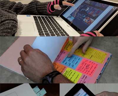
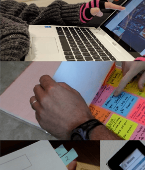
A good usability test starts with well-written tasks that give the user a goal, but lets them accomplish that goal on their own. This is coupled with follow-up questions that start a conversation, rather than simply searching for a positive response to validate the design team's assumptions. The team should walk away knowing which features worked, which need improving, and why.
Interface & graphic design
And finally, once we're certain we've found a design that satisfies our users' needs in a way that's usable and accessible, we can move on to the visual components. And if it's possible, there's nothing wrong with another round or two of testing with the visuals in place.

